WAVE accessibilities Report

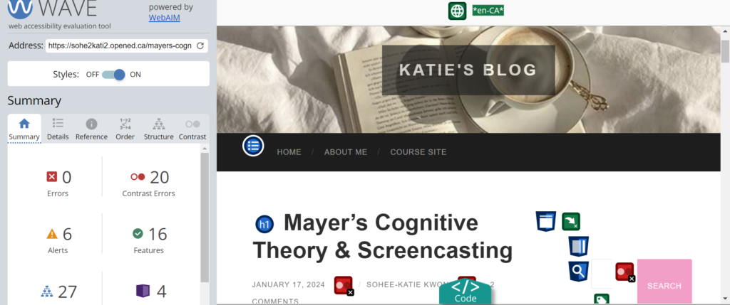
The WAVE accessibility report is a true game-changer. Honestly, I never considered accessibility or inclusivity when creating blog posts, and I feel a bit shy and ashamed about it now. This opportunity made me realize, referencing ‘inclusive principles,’ that designing for people with disabilities actually results in designs that benefit everyone universally. Referencing the video ‘How Captions Increase ROI and Audience for Media Creators,’ it was surprising yet made sense that a lot of people rely on captions even if they do not identify with disabilities. This proves that considering disabilities in mind actually does increase ROI and engagement.
My focus was primarily on amplifying the aesthetics of blog posts and ensuring high-quality content, rather than considering whether my blog posts would be accessible to a wider audience. To my surprise, the WAVE accessibility report revealed numerous errors, particularly around structural elements. I believe my blog posts were nicely organized and structured in a way that was easy to follow. I did anticipate having contrast errors, as I used a pink-coloured font for highlights, which may not contrast well with the background colours. However, I never realized this could potentially pose challenges for visually impaired readers or those who have a hard time absorbing lighter colours.
Moving forward, I will ensure to change the highlight colours and use headings and subheadings correctly to provide a smooth reading experience for all types of learners. When creating videos, my goal is to include captions and incorporate user controls, allowing learners to have control over the speed and sequence of their learning.
Text-to-Speech Tools Experience
I have never used Text-to-Speech tools before, but I find them very useful as I am an auditory learner. I tend to read out every single word when I study, write, or read books. This helps me understand the context better. I tried several voices to find the one that suited my learning style the most. I find that female voices are the most effective in absorbing information that is context-heavy, such as module posts or university textbooks. In contrast, my first introductory post was much easier to absorb and had just the right tone of voice when narrated by Ana, a child. I believe the choice of voice depends on the content, the audience, and the purpose of using the tool. For example, a fairytale book might be better with a child’s voice, whereas a mystery book would suit an adult’s voice.
Exploring the Impact of Media and Multimedia in UDL-Inspired Learning Environments: Aligning Promising Practices for Text, Images, and Video
Media and multimedia can play a significant role in a learning environment designed with UDL guidelines in mind. I believe every practice outlined in UDL is aligned to create an inclusive and effective learning environment. In terms of videos, it could be as simple as ensuring there are captions available on videos. As an example, I personally find transcripts (presentation guidelines) as a huge aspect of UDL, especially for someone with English as their second language. Sometimes, captions are not enough for me to fully grasp concepts. For example, Google Meeting provides this awesome feature where transcripts will be automatically generated when meetings are recorded! This has been helping me a lot to learn new skills and manage the intrinsic cognitive load.
Inclusive Design
Inclusive design means that regardless of your gender, religion, disability, skin colour, culture, etc., you can absorb and appreciate the content created, driving engagement and participation. When you start to narrow down your audience, biases, stereotypes, and specific images can emerge, leading to a situation where inclusivity is compromised. I believe that even when targeting a specific audience, content can be designed to be inclusive, provided it aligns with a specific topic.
Infographic on Canva Experience
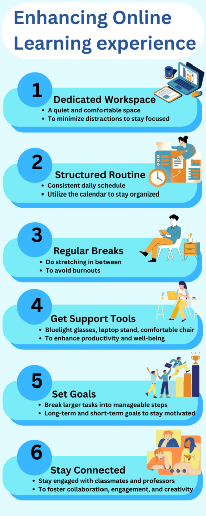
When creating my infographic on Canva, I focused on utilizing principles such as hierarchy, proximity, colour palette, and alignment. According to my WAVE accessibility report, I noticed that I had been misusing the colour palette, which could have posed challenges for readers. This time, I made sure to include enough contrast between the background and font colour, as well as maintaining a cohesive colour theme of light yellow and orange.
In terms of hierarchy, I ensured uniformity by using one font and a larger size for subtitles, and another font with a smaller size for brief explanations. I made an effort to ensure that visuals had close-to-perfect proximity to give the infographic an organized appearance. Alignment refers to how I stayed focused on this narrow topic, providing well-aligned content.
Overall, I had fun creating it! Being a colour enthusiast, I could not resist incorporating vibrant and playful colours.
Here is my infographic on how to enhance the online learning environment

Enhancing Accessibility for Learners with Visual Impairments in an Online Environment
Every aspect of the ‘Design principle’ applies to this question, from colour choice and maintaining a consistent style to keeping fonts simple and limited, choosing the right size, and utilizing a hierarchy of information. Specifically, I selected blue as my primary colour and orange and yellow as secondary colours for my infographic. After researching colour-blind-friendly options, it was found that these three colours are the most suitable. I aimed to be as inclusive as possible by choosing the right colour palette.
I also aimed for a consistent visual style to enhance alignment and cohesiveness. Additionally, I made an effort to include the appropriate amount of text related to the topic, reducing the extraneous cognitive load to ensure the delivery of an effective infographic.
Hi! Thank you for sharing what you’ve learned. I believe I’ve also gained new insights from reading your post. When designing websites or apps, I tend to prioritize aesthetics. However, I’ve never considered how it might affect people with visual impairments. Adjusting our colors to be visible to everyone not only aids those with impairments but also reduces strain on the eyes for others. From your infographic, I noticed elements that I could have incorporated into mine. For instance, you used larger fonts for improved visibility, which I believe was a wise choice. I could have followed suit and made mine slightly larger as well.
Overall, your post was very insightful for me.
Hello Maika!
After seeing the results from the WAVE report, I made a conscious effort to be as inclusive as possible – the report findings were quite shocking to me, haha. I’m glad you noticed how carefully I selected fonts. I experimented with various font sizes and types until I found ones that suited the overall concept of my infographic nicely 🙂